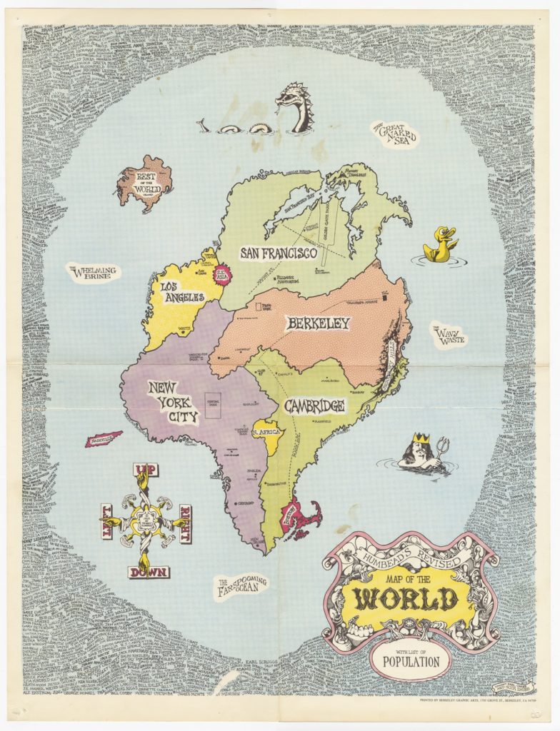
Humbead’s Map of the World
an excerpt from my memoir, Saturday Morning
by Rick Shubb
1968 would turn out to be an interesting year for me as a graphic artist. Besides the Carousel posters, there was another poster — Humbead’s Map of the World — that just might be my best known graphic work.
Why Humbead? That was a nickname given to Earl Crabb, who was the co-creator of this project. They called him the Great Humbead, although I’m not sure why. Maybe because when given some new piece of interesting information he would often just say “hmmm,” reserving further comment for later. It didn’t take much to get a nickname in those days.
Our first meeting, and the genesis of the map, occurred nearly a year earlier at the Campus Music Shop. One busy Saturday afternoon several people were in the shop, and one guy was asking around, trying to find a ride to Kansas City. His actual destination was New York, but he had already lined up a ride from Kansas City to New York, so he just needed a ride to Kansas City. “I guess I’ll just go down to the freeway onramp,” he said, “and hold a sign that says Kansas City.”
Another guy spoke up. “No, make the sign say New York,” said the guy who turned out to be Earl Crabb. His reasoning was that the chance of finding a ride would be better, New York being a more common destination. But he didn’t express it that way. He went on to say, “…because New York is closer.”
“He’s right,” I chimed in, catching some idea of where he was going with this. Maybe not geographically, but in most ways that actually affected us, New York was closer to Berkeley than Kansas City was.
“Here, I’ll show you,” said Earl, and he picked up a scrap of paper and pencil and began to sketch something. It took him about fifteen seconds, and then he handed it to the guy. I came over and looked at it, too. He had drawn a random shape that was supposed to be a land mass, which he labelled “the world,” and within it he placed these “countries:” Berkeley, Los Angeles, New York, and Cambridge.
His little map had a stunning truth about it. You did tend to see the same people in Berkeley that you’d see in Cambridge, at least within the folk music scene. There was a similarly common population pool shared by NY and LA, and he’d arranged them so as to support this. Socially, if not geographically, it felt just as valid as a “real” map. He had drawn it so quickly, and presented it so confidently, that it was clearly a theory he had already postulated.
I was infatuated with his concept, and long after the guy who needed the ride had left, Earl and I continued to discuss, develop, and redraw his little map. I suggested the addition of San Francisco, and lobbied for Nashville. We threw in Southeast Asia. Since the Viet Nam war could not be ignored, it had to be included in our world. We created a tiny island offshore called “rest of the world island.” It went on. Within the cities, or countries as we called them, we added the important clubs and music shops. The entire perimeter of the land mass was called the Mexican border.
At some point I said, “You know what? This would make a great poster,” and told him that I had skill and some experience as a graphic artist.
“Hmmm,” he said. For several seconds we just looked at each other silently. We both knew this was not going to stop here. He offered to front the cost of the printing, and to market the poster, if I would do the artwork.
I went to his apartment for dinner that evening, and our enthusiasm for the project kept rolling, but we had not yet come upon the idea that would make our poster a hit. We would before the night was over. While brainstorming over what else should be added to our world, we looked at the fact that our map was a social report, not a geographical one, about where people went and the paths they took to get there. We had the places, so what about the people? We decided to add peoples’ names to our map. We set out to identify and include the population of this world.
We joked about it as a sales gimmick. If you walked into a book store, and saw a poster for sale that had YOUR name on it, could you resist buying it? But it would become more than that. We began making a list of names of people to be included. Some were friends and acquaintances, others were famous people. It was not everyone we could think of, but it was not limited to people we liked. Soon something started to become clear: we both understood which names belonged in this population, and which did not, and yet neither of us could have explained why. We never disagreed about a name. Some people were just map people, and others were not. The map had taken on a life of its own.
While I was working on the layout for the actual map portion of the poster, we continued to add names to our list. We accepted very short lists from a couple of trusted friends, after trying to explain to them about the criteria for selection, which defied explanation.
By the time I was putting ink onto illustration board, the list had 1,056 names. I packed the names together around the outside of the poster, flowing organically around each other, forming a wide oval border for the map. Adding the names was tedious, as each had to be carefully hand lettered and made to fit together with few gaps. There was no discernible order — alphabetical would have ruined it, and was impossible anyway — but as I went along I tried to create a sort of controlled randomness to their placement. Whenever two or more names were associated with each other, such as music partners, they would not appear together. Instead I tried to make unlikely combinations and clusters. When someone first encountered the map, they typically would first be amused by the “countries” (Berkeley, NY, SF, etc.), but then if it held their attention long enough, they would spot a familiar name among the swarm of names, and their eye would start to meander. Soon they would be reading aloud odd combinations, and smiling.
It takes a long time to look at this poster. If there were some way of tracking stats on a printed poster like there is for a web page, I’m sure it would rank high on the list of total viewing time logged. Because it would hold your eye for an unspecified time, and held up to repeated viewing, people often mounted it on the wall of their bathroom. I’ve seen them on refrigerators, too. That appeal might be responsible for the map’s enduring reputation. That combined with the sense of personal association many people felt with it. It confirmed a world that they already perceived. They felt like part of this world, whether their own name was included or not. But especially if it was.
The poster sold well, selling through two printings and into a third. Before the second printing I cleaned up the art a little, correcting an unintended gap between dot screens, making some of the colors more vivid, and adding a few more names. For the third printing I did entirely new art from scratch. On this version the list of names (still more added) appears in two scrolls within the artwork. The art and colors are far superior on the third printing, but collectors being how they are, the first is the one they want, even though the third is the best looking.
Humbead’s Map of the World with List of Population has been seen as a snapshot of its era. It was featured prominently in a popular book, Baby Let Me Follow You Down (the Illustrated story of the Cambridge folk years) by Eric Von Schmidt and Jim Rooney. Many years later it was the centerpiece of an art exhibit at the Berkeley Art Museum, and a concert was presented at the Berkeley Veterans’ Building Auditorium in conjunction with that exhibit. The concert was produced by Country Joe McDonald, himself a Berkeley icon, and it featured many performers from the Berkeley folk scene who were active at the time the map was created. In order to play in the concert, your name had to be on the map. Fortunately, I had thought to put my own name on the map, so I played a set in the concert. And I was pleased to acknowledge Earl Crabb, who was in the audience that night.
To this day, more than forty years after it was created, people still display Humbead’s Map of the World. If their name is on it, they point proudly to it. It identifies them as part of an exclusive club that accepts no new members. Not exactly what we had in mind back then, but perhaps it is what the map itself had planned all along.