
by Rick Shubb
The Carousel was only open for a few months, but in its day, it was the hippest of San Francisco’s rock palaces.
The Fillmore and the Avalon were already in business before the Carousel was born. I don’t remember which of those two came first; although I’m sure it’s well documented. They were both outgrowths of the Acid Test, an event in SF hosted by Ken Kesey that forever bonded rock music, light shows, and LSD. Each weekend the Fillmore and the Avalon featured three rock bands, either emerging Bay Area bands or traveling acts.
In 1968 a few of the SF bands decided that they could eliminate the middlemen and operate a venue like this themselves. Much like the old movie where the kids decide to put on a show in the barn, only instead of Mickey Rooney and Judy Garland, it was Jerry Garcia and Janis Joplin. Had it been directed by Busby Berkeley, it might have succeeded, but the missing ingredient was business savvy. No amount of dope and optimism could substitute for that.
The cooperative consisted of the Grateful Dead, the Jefferson Airplane, and Quicksilver Messenger Service. There might have been one more. They called themselves Headstone Productions, suggesting that the Dead were in the driver’s seat. They were the most together, business-wise, of the groups. Imagine that. Anyhow, it was mostly the Dead that I dealt with.
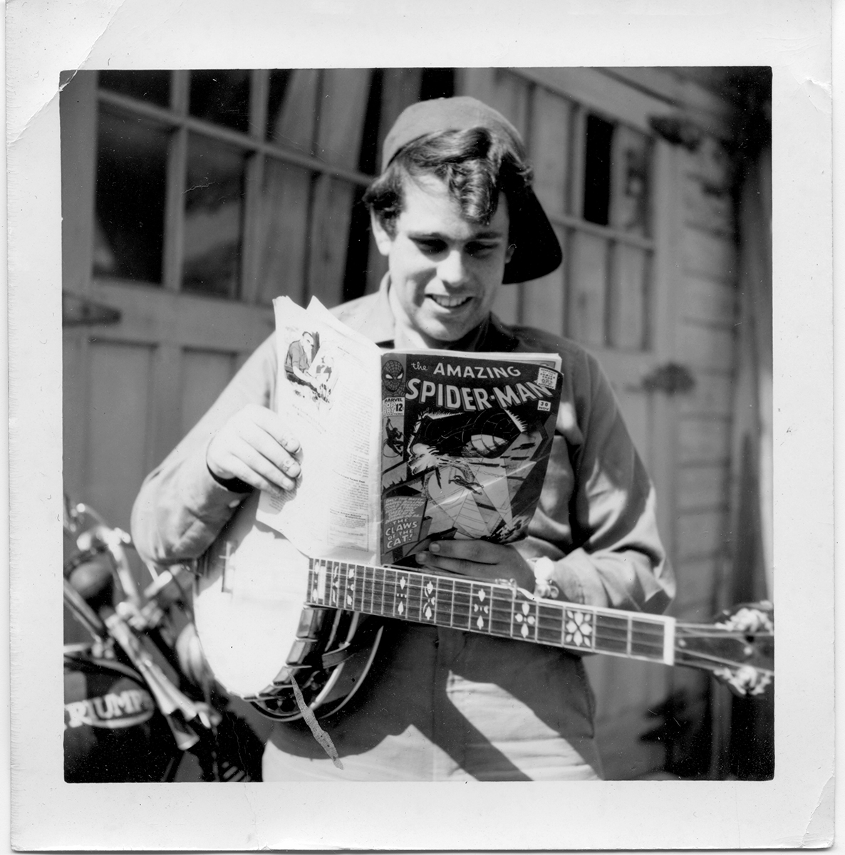
I came on board around three or four months in, near the end of the Carousel’s brief run. Most of the other SF poster artists of the time, at least those whose names became familiar, were considerably more professional than me. By that I mean that they already had studios, were working full time as commercial artists, and had considerable experience with the print medium.
I was a rookie. I was not working as an artist, and my self-image and lifestyle were more that of a musician. I was supporting myself, more or less, by giving banjo lessons and playing occasional gigs. But I always carried a sketchbook around, and everyone liked my drawings. During those late-night parties, which happened just about every night, I always had my sketchbook in hand. I chronicled those experiences with drawings interlaced with scraps of quotes gleaned from the conversations. Either hysterically funny or somehow important at the time, these text blurbs survive as odd non-sequitors.
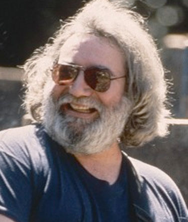 Garcia, a talented graphic artist himself, had always been particularly fond of my drawings. At a point when the Carousel people were looking for ways to distinguish their operation from the other two rock ballrooms, Jerry put me in touch with Ron Rackow —the business manager for Headstone — and told Ron that I should be doing their posters.
And so I did, ready or not. The plan was for me to become their primary poster artist, doing most if not all the posters, thereby giving the Carousel a distinctive look. I had to learn to work fast, because bookings were seldom made very far in advance. I never had more than a week for a poster, and typically worked around the clock.
I was paid $125 per poster. This doesn’t sound like very much now, but it was top dollar. In fact, at that time, most of the poster artists, even the big name guys, were making $100. By paying me more, they were giving me a vote of confidence as their boy.
Had the Carousel gone on longer, there would be more Rick Shubb Carousel posters. I couldn’t keep doing one per week, but the plan was for me to do as many of their posters as I could. Maybe if this had happened, I would be better know than I am as a rock poster artist, or maybe not. We’ll never know.
But my status as the Carousel’s main poster artist was not without controversy. My style was distinctive, and not everyone saw this as a benefit. Some of the hippies found it too grotesque. Hard to imagine nowadays, but in those days before the dark imagery of Goth, punk, etc. (some of which might even site my work among their roots) the creatures I drew seemed menacing to some. Not to me, of course. They always were intended to be kind of silly and benign. Yet they were a little scary for some teenyboppers. There was even a meeting at Headstone one day, in which this was the main topic of discussion. “We gotta find some new look,” Ron Rackow said, “the monsters are bumming people out.” I told him that I could try to imitate Mouse or Kelley, if that’s what he wanted, but I thought they wanted me because my style was different. I won the day. Finally, Rackow said, “Just keep doing what you do, man. At least people are talking about it.”
Also probably controversial, although never the topic of a crisis meeting, was my use of color. After my first poster, which used primary spot colors reminiscent of a circus poster, I moved toward softer pastels. This was a conscious departure from the bright colors favored by most rock poster artists. My effort at subtlety was somewhat thwarted by gaffs in the print process, yet the result may not have been viewed as typically psychedelic. And my imagery never included any obvious references to the new-age scene, such as eastern or Native American religion, dope-specific icons, or any of what I felt were sometimes heavy-handed comments on pop culture. My stuff came strictly from someplace inside me.
Oh, and one more thing. I liked the words to be legible. Even during the heyday of psychedelia, when everyone else was imitating Wes Wilson’s lettering that you had to be stoned to read, it seemed to me, fuddy-duddy that I was, that the main duty of a poster was to dispense information.
The First Poster
my first assignement was:
Steve Miller Band | James and Bobby Purify | Sons of Champlin
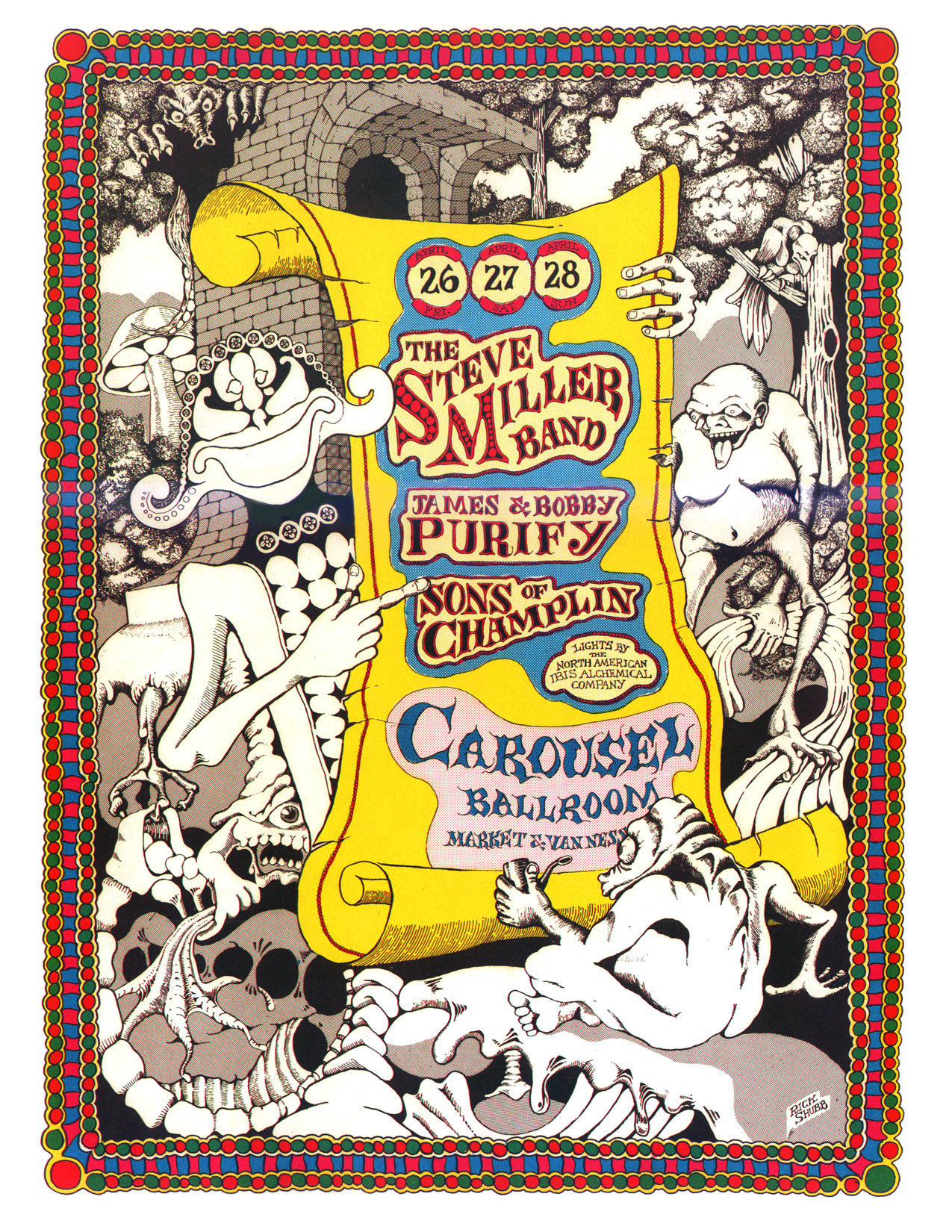 I had little experience in working with color for reproduction, so for my first effort I opted to play it safe by combining my distinctive black-and-white ink drawing style with a two-dimensional color motif employed in the borders. This layout enabled me to preserve the visual ambiguity of the ink drawing style I was known for, while still using the obligatory bright colors of a rock poster. That combination worked well, and became a signature in itself. I would use it again repeatedly in various projects.
But even within this relatively color-safe format, color became an issue. When I arrived at the printers with my original black and white art, I learned that Headstone Productions had only agreed to three inks instead of the customary four. It was obviously a cost compromise, and I don’t know why they decided to get cheap at that moment, but that was the deal. Being a kid, and lacking the courage of my conviction, I didn’t object. So the printers creatively opted to omit the black ink run, and achieved the black by overlapping the other three inks. They did an admirable job of keeping the thing in register, but the poster would have looked better if they had run it with four inks.
On this reprint we have a true, crisp black instead of the soft-focus sepia on the original print. I think it looks a lot better.
The Second Poster
Thelonious Monk | Dr. John the Night Tripper | The Charlatans
a really creative booking for a rock ballroom
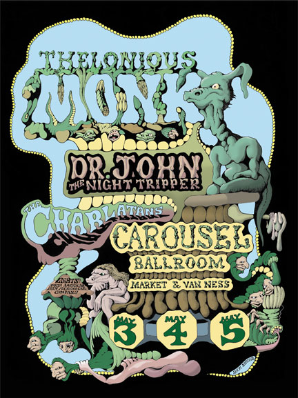 My second Carousel poster was for the week following my first, so I’d received the assignment and begun the artwork before the first poster had gone to print. When I learned of the 3 inks restriction, I drastically revised my concept of color on this poster which was already half finished. Since it featured green prominently, I had to have yellow and blue. After some anguish, I opted to sacrifice the red ink in favor of black, so the printed version of this poster ended up with a very restricted blue-green-yellow motif. The effect wasn’t bad, but not quite what I’d originally visualized.
The Monk poster in this set looks the way it should have, and would have if I’d had four inks, and about two more days to work.
The Third Poster
Electric Flag | Don Ellis Orchestra | PG&E
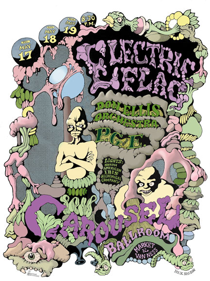 After struggling along with three inks for the first two posters, I finally put my foot down. “Four inks, or get yourself another boy.” Well, I got my fourth ink, but guess what? Instead of using the usual process colors, they substituted a much darker blue for cyan, and a true red for magenta. Don’t ask me why. As a result, the colors on the printed version were out of whack.
Again, included in this set is the poster as it should have looked if the colors had been applied correctly.
The third poster (Electric Flag) had just been printed, and I drove over to the City to have a look at it. The printed posters were laid out in a few stacks on the floor just outside the business office at the Carousel, waiting for people to pick them up for distribution around the City.
I was standing there looking at it, grappling with a bit of disappointment as to how the colors had been mishandled. Various people around the place were coming by, either admiring them, or just checking them out, but one guy was standing beside me looking at them for almost as long as I was. Eventually he spoke aloud, for me to hear. “Another Rick Shubb poster,” he said. “Not his best, though.”
I didn’t take offense at this, because he was astute. Maybe he wouldn’t have been as critical if the inks had been applied correctly, but in any case, he was not out of line. I decided to be coy, and said “Which of his work do you think is his best?” He proceeded to refer to an illustration I’d done in an underground comic book, and again his opinion was right on. At that point I identified myself. Holding out my hand, I said “I’m Rick Shubb.”
He shook my hand and said “I’m Owsley. Do you take acid?
The Fourth Poster
Jimi Hendrix | B.B. King | The Move
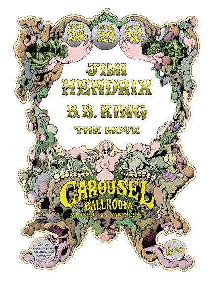 The legendary poster that was never printed, for the show that was never played. The Carousel went bankrupt the week before this show would have been presented. Had it gone on, the income from this show would surely have kept the Carousel in business a while longer.
Typically Headstone Productions would book a headliner only to learn that Bill Graham had them booked a week before. Graham was so smart that it was almost too easy for him to get the best of these guys. But this time, Headstone had Jimi Hendrix —at the height of his popularity — and they had beaten the other ballrooms to the punch.
I’d almost completed the black and white part of the artwork when I got the word that the show was cancelled. Headstone was defunct, the Carousel would close, and Bill Graham would take over the facility, moving from the old Fillmore Auditorium into the Carousel and renaming it Fillmore West.
A few moths later, I modified the art for the Hendrix poster to be used as a title page for an underground art book, and the original artwork got pretty butchered in the process. In recent years, when I got interested in preserving and restoring these Carousel posters, I dug out the original art, still in its modified form. Beneath an overlay of illustration board and quite a bit of rubber cement, was buried the original lettering advertising Jim Hendrix, B.B. King, and The Move. Some of the lettering peeled up with the rubber cement, but I restored it digitally. Patches of the surface were discolored, and again, I was able to restore it. The dates had not been entered at the time, and the color had not yet been done. I added the dates when I restored the art (I’m pretty sure they’re the right ones) in the same style I used then, and added the color then as well. While I must admit to not remembering exactly what color scheme I’d intended at the time, I’ve made it consistent with the direction I’d been taking with these posters.
About the drawing and printing process
Most full-color printed material that you see, unless it was printed directly from someone’s computer on an inkjet or laser, was produced by four-color process. That is, printed on a press that uses four colors of ink: cyan, magenta, yellow, and black, or CMYK for short. The four inks are applied one at a time, in four passes, and combine in various percentages to form all the colors you see. The process requires that all the subtle colors be separated into shades of those four process colors, so that four separate plates can be made.
These days color separations are usually done by software, and we don’t need to even think about it. But in 1968, when these posters were first printed, stone axes were used. If the original art was done in full color, then the separations were made by shooting the art through filters. This was sometimes done by the same people who would run the art on the press, or sometimes by a completely different company that specialized in pre-press camera work. In either case, these professionals wanted to be paid well for the service.
The producers of rock concerts, being cost conscious (read: cheap), came up with another plan. They borrowed a technique that was developed by comic book companies; that of having the artist do the color separations manually. After all, comic book artists, like poster artists, worked cheaper than printers and camera technicians.
So all the art was done in black and white, and it was done on four separate boards. We (the artists) never saw it in color until it was printed, and then sometimes we were surprised …not always pleasantly.
We would first draw the basic art in black and white. The printer would then shoot the black and white original, and make us three copies called bluelines. Bluelines were printed on illustration board, in light blue ink that their camera would not see. Still working only with black ink, we would then make each of the bluelines into a master for each of the remaining process colors: one for cyan, one for magenta, and one for yellow. They usually only made us three bluelines, so we couldn’t make any mistakes.
Now, we’re talking about absolute black and white, here. Not grayscale. Anything that would appear in gray, or in a color other than 100% of a process color, was achieved with dot screens, using a product called zipatone. You bought zipatone at the art supply store. It was thin, clear, adhesive acetate sheets printed with dot screens, available in dots of various sizes, and ranging from 10% to 90% coverage. You’d apply the zipatone to the desired area of the art, burnish it down, and carefully trim it to shape with an X-Acto knife. The knife work was tedious and slow going, which is the main reason many comic and poster artists opted for brighter, solid colors; it was a lot quicker to fill in an area with black ink than to cut zipatone to a complex shape.
On my second and third Carousel posters, I wanted to press the limitations of the blueline separation process and achieve subtler use of color. On the bluelines for these I used a good deal more zipatone than solid black. I’d have to say that my ambition backfired on me, because it made the resulting colors harder to visualize. Then, when I was hit with a surprising 3-ink restriction, all bets were off.
I still have the original black and white art, but not the separations. I don’t know what became of them. I began this restoration project by scanning the black and white art, then I removed whatever signs of aging that I could in Photoshop, and finally added the color. I tried to remain true to my original concepts of color, and present these posters as I had intended them to look in 1968.